Case study
Truly Simple Tools
A 16-app software brand that speaks with a single voice.
The premise
The app market is flooded and AI has made building new tools and features nearly free. The standard software industry response is to add more: more features, more power, more whizbang tech injected into everything. Truly Simple Tools works from the opposite premise.
If “good enough” software is now abundant and disposable, then trust, accountability, restraint, and a clear point of view become scarce and valuable. TST is a bet that those attributes are worth paying for. The brand, the voice, the naming system, the pricing model, and the app architecture all express this single position.
The reference point: beloved store brands
Think ALDI, Kirkland, Muji. Basics-focused, priced honestly, and trusted more than their positioning would predict because they’re consistent and candid about exactly what they are. TST aims not to be the cheapest, nor the flashiest, but the one you reach for because it reliably does what it needs to do and then gets out of the way.

The constraint is the product
I make and manage the entire product: brand visuals and voice, naming, UX, copy, and development direction. This is a guiding creative constraint that shapes the TST catalog. I avoid features that would require expensive or cumbersome upkeep. I avoid features that are too complex or ambiguous to explain to my non-tech-savvy friends. Each of these tools is built for individual users to give them outsized leverage in some aspect of their lives. And ultimately, every user has my contact information, which is both an accountability mechanism and a reminder that I’m building for real people, not personas or market segments.
Position in practice
Four places where TST’s positioning is reinforced by concrete guidelines.
1. The voice
Truly Simple Tools is the reliable, trusted neighborhood mechanic. Conversational but not chatty. Plain-spoken, but never dumbed down. It tells you what happened, what it did about it, and what you can do next. Then it gets out of the way and lets you get on with your life. No exclamation points standing in for substance, no manufactured personality. The voice is competent and always happy to help, because that’s what trust sounds like in a noisy world.
Three rules behind the voice
These principles help me filter every line of copy and microcopy before a new app ships.
1
Minimalist
Focus on the task at hand and nothing else. Cut every word that isn’t fighting for its right to exist. Sentence case, active voice, no onboarding theater.
- Use
- Simple, universal verbs
- Avoid
- Jargon, puns, acronyms
2
Practical
Speak to the user’s goal and the time it saves them. Front-load the words that matter so a skim still works, and say exactly what happens next.
- Use
- Action verbs: “Save image,” “Convert to PDF”
- Avoid
- “Submit,” “Click here”
3
Confident
Emphasize ownership, stability, and privacy. Say it once, clearly, and stop talking. Cordial and direct, never needy or hyperbolic.
- Use
- Calm, declarative statements
- Avoid
- “Please rate us!”, emojis
Where the voice sits on NN/g’s four dimensions of tone
Holding this position across all customer touchpoints and all sixteen apps is what makes a multi-product brand feel like a single, cohesive entity.
This, but not that
Thinking in terms of failure modes that must be avoided also helps clarify, reinforce, and maintain the proper voice.
- Confident, but never arrogant.
- Plain-spoken, but never dumbed down.
- Helpful, but never overbearing.
- Simple, but never simplistic.
Voice in practice: error state
Rejected
“Oops! Something went wrong 😬 Don’t worry, our team is on it. Please try again later!”
Chosen
“That didn’t save. But don’t worry, your file is still here, unchanged. Try again, or check your connection if it keeps happening.”
Why: The rejected line performs reassurance without giving information. The mechanic doesn’t say “oops,” they tell you your car is fine and what to do next, or how to fix a genuine problem with the minimum of anxiety. The chosen line protects the user’s work, then names the likely cause and trusts them to act.
From voice to component rules
Brand voices sometimes fall apart when translated to the fiddly details. Creating clear rules for modals, empty states, toggles, and errors, where copy might otherwise become vague, defensive, or dissonant, helps maintain a consistent voice even in the cracks and shadows of an interface.
| Pattern | TST writes | Not |
|---|---|---|
| Destructive confirm | Delete project The button names the exact action, paired with a “Keep project” option, never an ambiguous “Cancel.” | Yes, delete, OK |
| Empty state | Create invoice Say what belongs here, then offer the specific first action by name. | Get started |
| Settings toggle | Enable dark mode Positive statements only, checking a box should never be a double negative. | Disable light mode |
| Inline error | Add an “@” to your email address. Name what to fix; the system failed, not the user. Never accuse, avoid using “You.” | Invalid input |
2. The naming system
The “Truly Simple” naming convention makes these tools scannable in a crowded list of competitors. Though like the app logos, the nomenclature is intentionally flexible so that apps optimized for different markets can properly compete (“Authorcise” and “Story Wiki” perform better without the “Truly Simple” prefix, for instance). The TST tagline “Good basic apps” hints at a straight-talking ease and reinforces the brand’s commitment to reliable, no-nonsense functionality.
3. Pricing as a promise
Every app is free to try, with a single, lifetime Pro unlock when it earns its keep. No subscriptions, no ads, no tracking, no analytics quietly phoning home. Pricing is usually treated as a growth lever; here it’s a statement of values: try it first, pay once, own it. For some, this pricing convention (and how it’s expressed) is the clearest and most convincing TST brand element.
4. Bare-metal Apple UI
Every app uses native system components when possible. This is an aesthetic choice, as each element looks calm and unmistakably at home on the platform. But it’s also a maintenance decision. Standard components are battle-tested, age well, and survive OS updates without demanding a redesign. For a one-person shop, “don’t fight the platform” is how you keep a portfolio of apps alive and functional. There’s restraint in the pixels and code, not just the prose.
The outcome
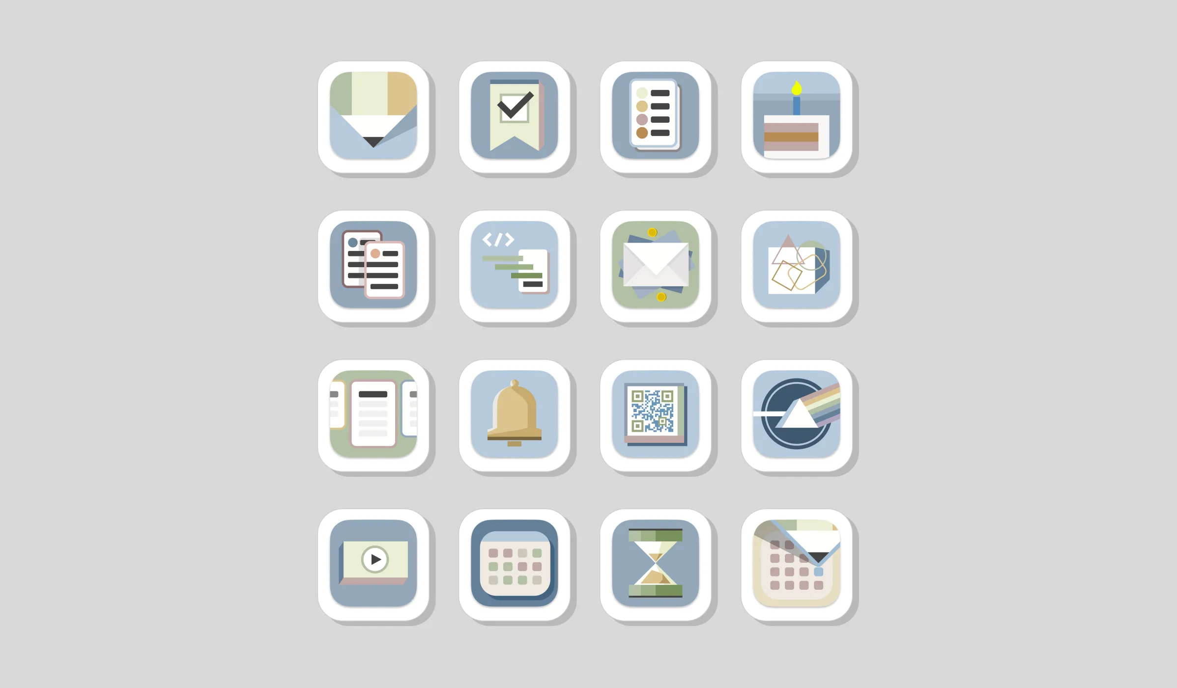
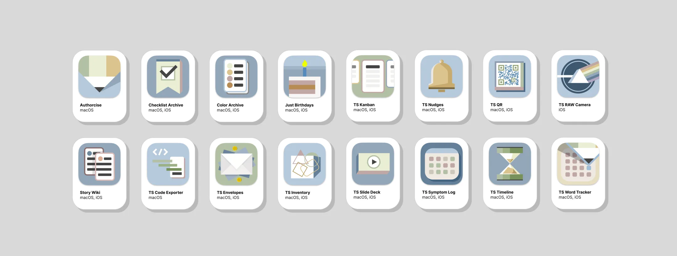
Sixteen apps with a single, coherent identity make up a catalog that communicates its values before anyone taps an icon, and profitably so, in its first year. That year brought nearly 4,000 downloads across 100+ countries, with paying customers in 29 of them.
The trends back the thesis. Daily downloads grew roughly 80% year over year. Monthly in-app ‘Pro‘ purchases more than doubled across the first five months of 2026. And about 1 in 18 downloads converts to a one-time Pro unlock, all with zero ad spend, no tracking, and no pushy in-app upsells. (There have been five app refunds, total, to date.)
The naming tells you what each tool does and that it belongs to the family. The voice reinforces trust across every touchpoint. The product strategy doubles down on those priorities and commitments.
Zoom in: Truly Simple Nudges
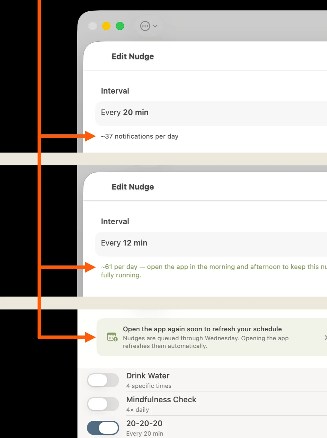
TS Nudges is a tool for creating alerts and managing habits. The Apple ecosystem has a built-in constraint that limits each device to 64 notifications per app. This can complicate the habit-reminder experience, as some users may approach or surpass this limit with just a single custom nudge (a reminder that tells the user to look away from their device every 20 minutes will tally 37 notifications per work day, for instance).
Microcopy that illuminates the murky
Whenever possible, the complicated should be made simple for users. They still need to understand how to manage these sorts of constraints, though, and that often means helping them understand the constraint without being overwhelmed by it. In this case, TS Nudges provides a live, daily notification count for the user as they adjust the notification interval for a given nudge. That count includes a brief, instructional warning when the limit is approached, along with guidance on how to avoid functionality interruption. This is reinforced in the main app window, where a calm, informative alert message tells the user how many days they have before the app will need to be reopened so the notification queue can be refreshed.
Voice in practice: informative & actionable
Rejected
“Reopen TS Nudges regularly to ensure reliable notifications.”
Chosen
“Nudges are queued through Wednesday. Opening the app refreshes them automatically.”
Why: Rather than giving instructions that sound vaguely threatening (“Open this app regularly or else!”), the chosen microcopy provides specific, actionable information based on the user’s current context, delivered in a blameless, generally positive way.
UX and organization
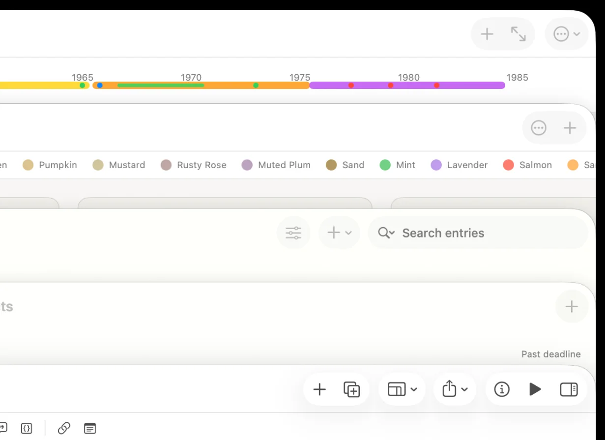
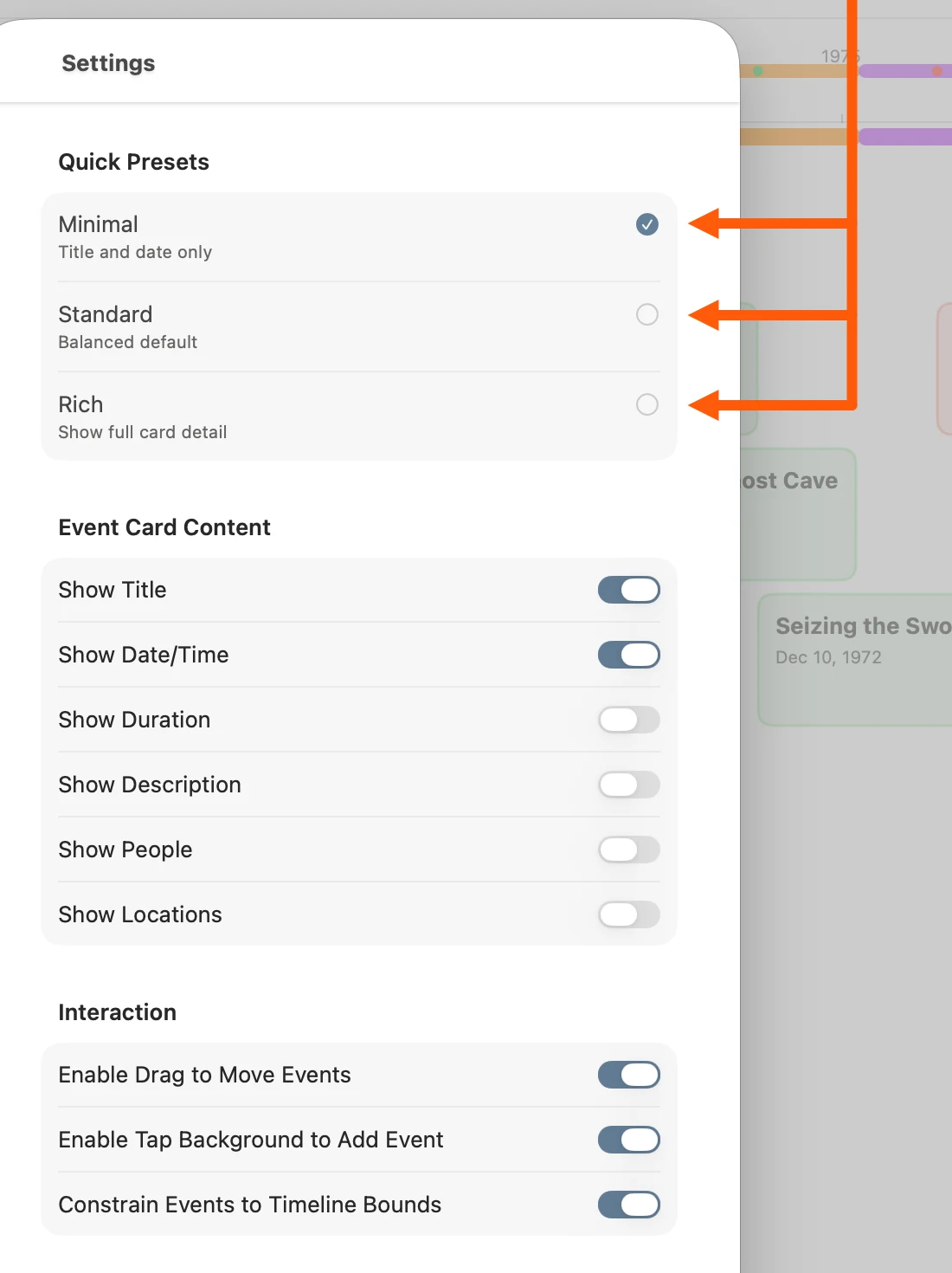
Truly Simple Timeline is a complex worldbuilding tool that helps writers and other creatives manage their narratives. Timelines can become intricate and sprawling, so clear, concise microcopy is essential to helping users understand their options without overwhelming them. A trio of presets — Minimal, Standard, and Rich — helps users find meaning in the mess.
The takeaway
Truly Simple Tools has many products but a clear, singular voice. Its principles are consistently applied across all touchpoints, ensuring a cohesive user experience and a steady reinforcement of the brand’s trustworthy, reliable, and practical identity.